Case Study — Customer App
Local Grahak — Customer App
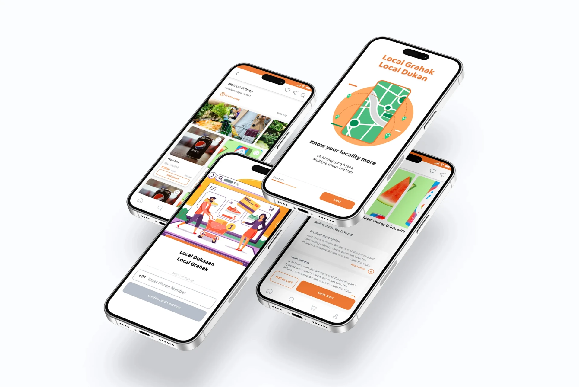
Bringing the local shopping experience to mobile — discover nearby stores, browse products, compare offers, book purchases and access digital bills.
01 — Project Overview
A digital journey for local shopping
Local Grahak is a customer-facing app that makes it easier to discover and shop from nearby stores — from finding a shop to accessing the final bill.
02 — The Problem
Local shopping is fragmented
How might we make local shopping more discoverable, transparent and convenient while keeping it simple enough for everyday customers?
Finding the right shop
Customers have no easy way to see which nearby stores stock what they need.
Unclear availability
Product ranges and stock live inside the shop, not online.
Opaque pricing
Offers and discounts are hard to compare before visiting.
Manual ordering
Purchases need a call or a visit to place and confirm.
No booking record
Once ordered, there is no shared status to check.
Paper bills
Receipts are easily lost, making returns and records painful.
03 — Design Goals
What the interface had to do
01
Make local stores discoverable
Surface nearby shops with location, distance and category.
02
Make products easy to scan
Image-led cards carrying quantity, price and offer.
03
Reduce booking friction
Clear Add to Cart and Book Now actions.
04
Give visibility after booking
A dedicated Booking Status view.
05
Digitise post-purchase
A downloadable digital cash receipt.
04 — Customer Journey
Discovery to post-purchase
        LOGIN / SIGN UP
               |
        CUSTOMER PROFILE
               |
      DISCOVER LOCAL SHOP
               |
      VIEW SHOP & PRODUCTS
               |
     +---------+---------+
     |                   |
 ADD TO CART          PRODUCT
                         |
                     BOOK NOW
                         |
                  ORDER CONFIRMED
                         |
                   BOOKING STATUS
                         |
                  DIGITAL RECEIPT
05 — Key Screens
The experience, screen by screen
Login, store discovery, catalogue, profile, confirmation, booking status and the digital receipt.
Login / Sign up
Local Shop
Product Catalogue
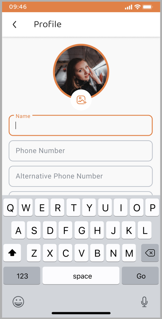
Profile
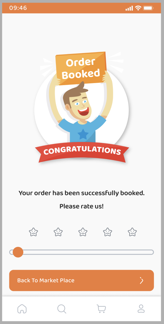
Order Booked
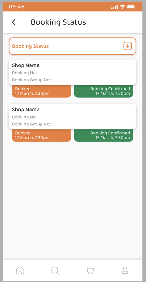
Booking Status
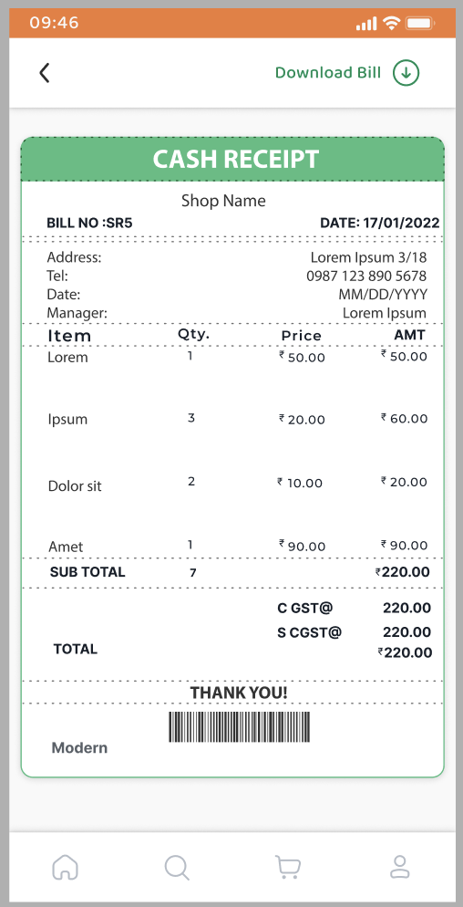
Digital Receipt
06 — Onboarding & Login
Phone number as the front door
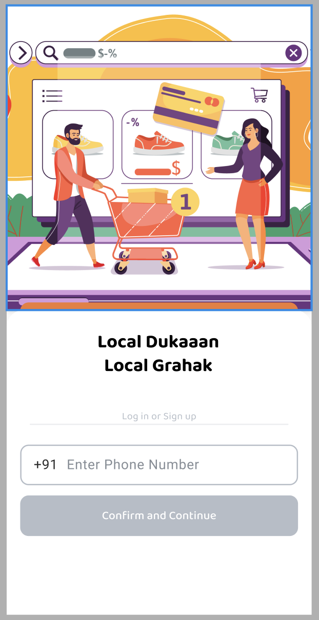
Country code, phone number, Confirm and Continue. The CTA stays visually disabled until a number is entered, so the missing input is obvious.
Familiar authentication
A mobile-first Indian audience already treats the phone number as identity — no passwords in the first interaction.
Proposition first
“Local Dukaan, Local Grahak” with an illustrated shopping scene sets the relationship between stores and customers immediately.
07 — Shop & Product Discovery
Context before catalogue
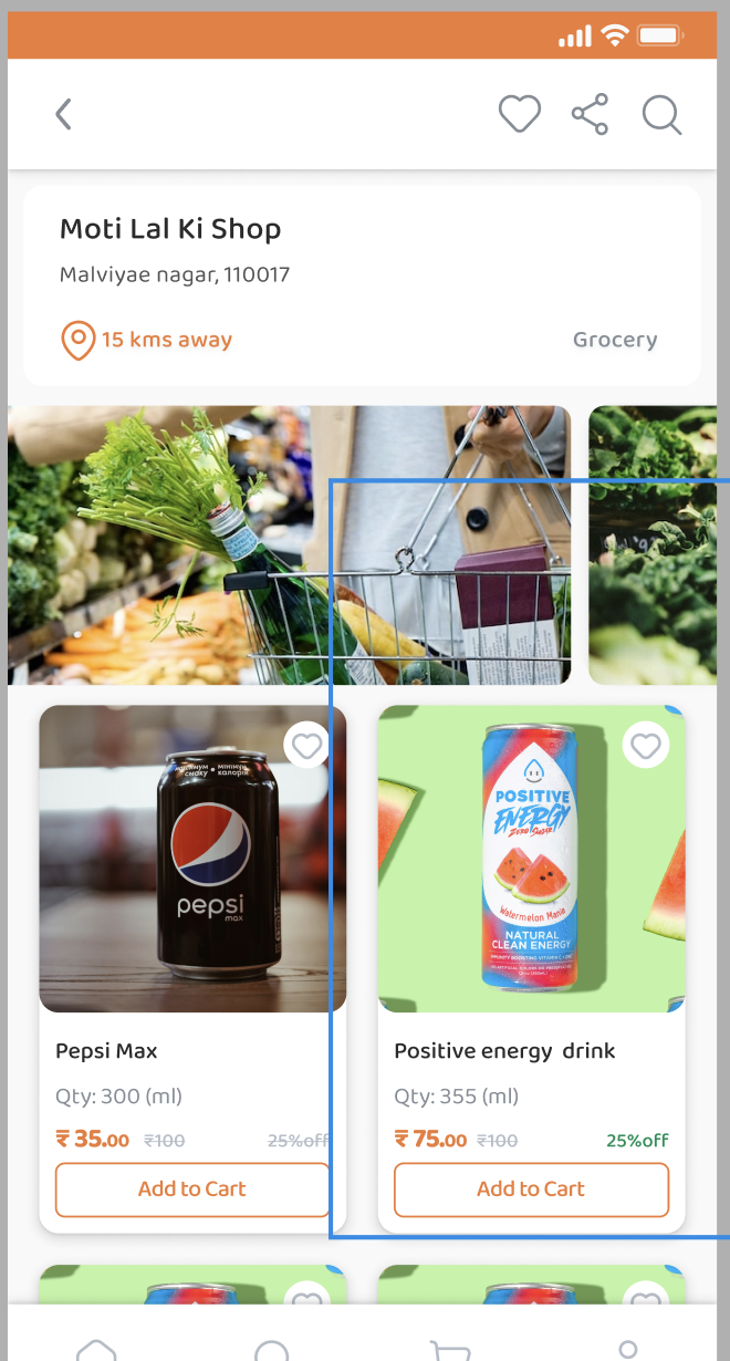
Moti Lal Ki Shop · Malviya Nagar 110017 · 15 kms away · Grocery — the store is understood before its inventory is browsed.
Store context
Name, location, distance and category sit in a single card at the top of the shop.
Supporting actions
Back, favourite, share and search serve different intentions without stealing focus.
Card-based grid
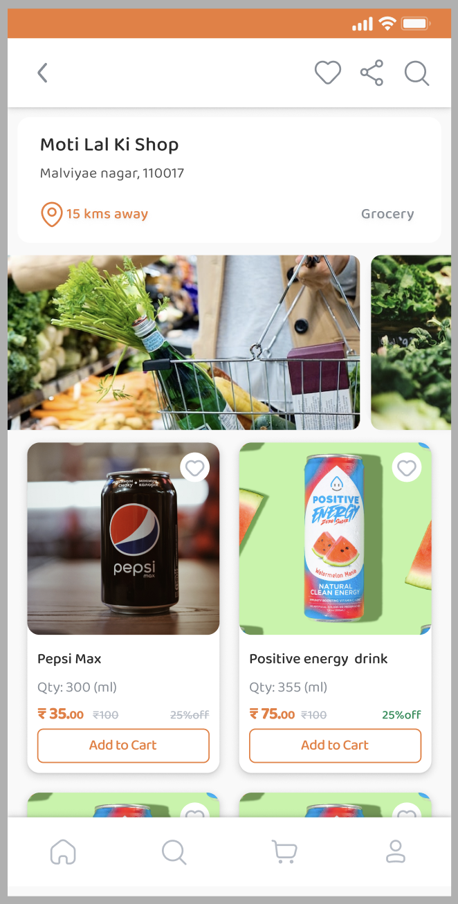
Image → name → quantity → price → discount → CTA, repeated for fast comparison.
08 — Product Card Anatomy
Six layers in one card
Pepsi Max — 300 ml — ₹35 (₹100, 25% off). The card balances information density with a single obvious action.
Visual
Large product photography for instant recognition.
Information
Product name and selling quantity.
Pricing
Orange current price, subdued original price.
Offer
Discount separated and highlighted.
Action
Outlined Add to Cart as the clear next step.
Secondary
Heart icon to save a product for later.
09 — Purchase Decision
Two paths, one product page
Product imagery, selling unit, description and item details lead into a pair of CTAs.
Add to Cart
For customers who want to keep shopping across the catalogue.
Book Now
For customers who have already decided and want to finish.
10 — Navigation & Profile
Four destinations, one form
Home · Search · Cart · Profile stay persistent, while the profile form keeps large inputs, strong borders and clear labels for small screens.
Persistent bottom nav
Familiar iconography keeps movement lightweight and text-free.
Focused fields
The active field uses the orange accent to communicate focus.
Editable identity
Name, phone, alternative phone and a profile image.
11 — Confirmation, Status & Receipt
Designing the post-task state
The journey does not end at “success” — it continues into tracking and a permanent record.
Order Booked
Confirms the transaction, invites a five-star rating and routes back to the marketplace.
Booking Status
Shop name, booking number, group number and time, split across Booked and Booking Confirmed states.
Digital Cash Receipt
Bill number, store details, itemised lines, subtotal, GST, total, barcode and Download Bill.
12 — Visual System
Orange-led, quietly structured
Orange carries headers, pricing, active states, CTAs, focus and location; hierarchy comes from size and weight rather than decoration.
Orange accent
#E8752A
Surface white
#FFFFFF
Light grey
#F4F5F6
Confirm green
#3B9E5F
Charcoal text
#2C2C2C
13 — UX Challenges & Solutions
Decision log
Users need to identify local stores
Name, address, category and distance surfaced together
Customers need to scan products quickly
Image-led cards with structured information
Discounts need visibility
Price, original price and discount separated visually
Users need a clear purchase action
Prominent Add to Cart / Book Now CTAs
Customers need confirmation
Dedicated Order Booked success state
Users need post-booking visibility
Booking Status screen
Physical receipts get lost
Digital cash receipt with Download Bill
Users want to keep shopping
Persistent bottom nav and marketplace CTA
14 — My Approach
Five principles
Discoverability
Helping customers understand where they are shopping.
Clarity
Making products, prices and offers easy to scan.
Action
Providing an obvious next step at every stage.
Continuity
Connecting discovery, purchase and receipt.
Consistency
Repeating patterns across the application.
15 — Areas to Explore Further
The next iteration
Design opportunities, not validated problems.
Search & discovery
Stronger search, filter and sort for larger catalogues.
Location
Make distance, delivery and pickup expectations explicit.
Booking status
A visual timeline from booked to confirmed.
Product comparison
Compare the same product across nearby stores.
Accessibility
Contrast, touch targets, screen-reader labels and font scaling.
16 — Outcome
One connected journey
Discover a local store → browse its products → evaluate price and offers → add to cart or book → receive confirmation → track the booking → access the digital bill.
A traditional local-shopping experience translated into a structured mobile product, while staying simple, approachable and commerce-focused.