Print Media Case Study — 2025
Ministry of Rural Development Annual Report 2024–25
Government of India · Publication Design · Editorial Cover
A cover designed to communicate the ministry's focus on rural transformation, inclusive development, livelihoods, and the impact of government initiatives through a strong editorial visual.
01 — Design Objective
One cover, many stories
The cover had to hold multiple development themes while remaining credible, official and uncluttered.
Represent rural India and its communities
Communicate growth, development and empowerment
Maintain a credible, official government identity
Combine multiple development themes without clutter
Create an engaging first impression for an official report
02 — Visual Concept
Collage-based storytelling
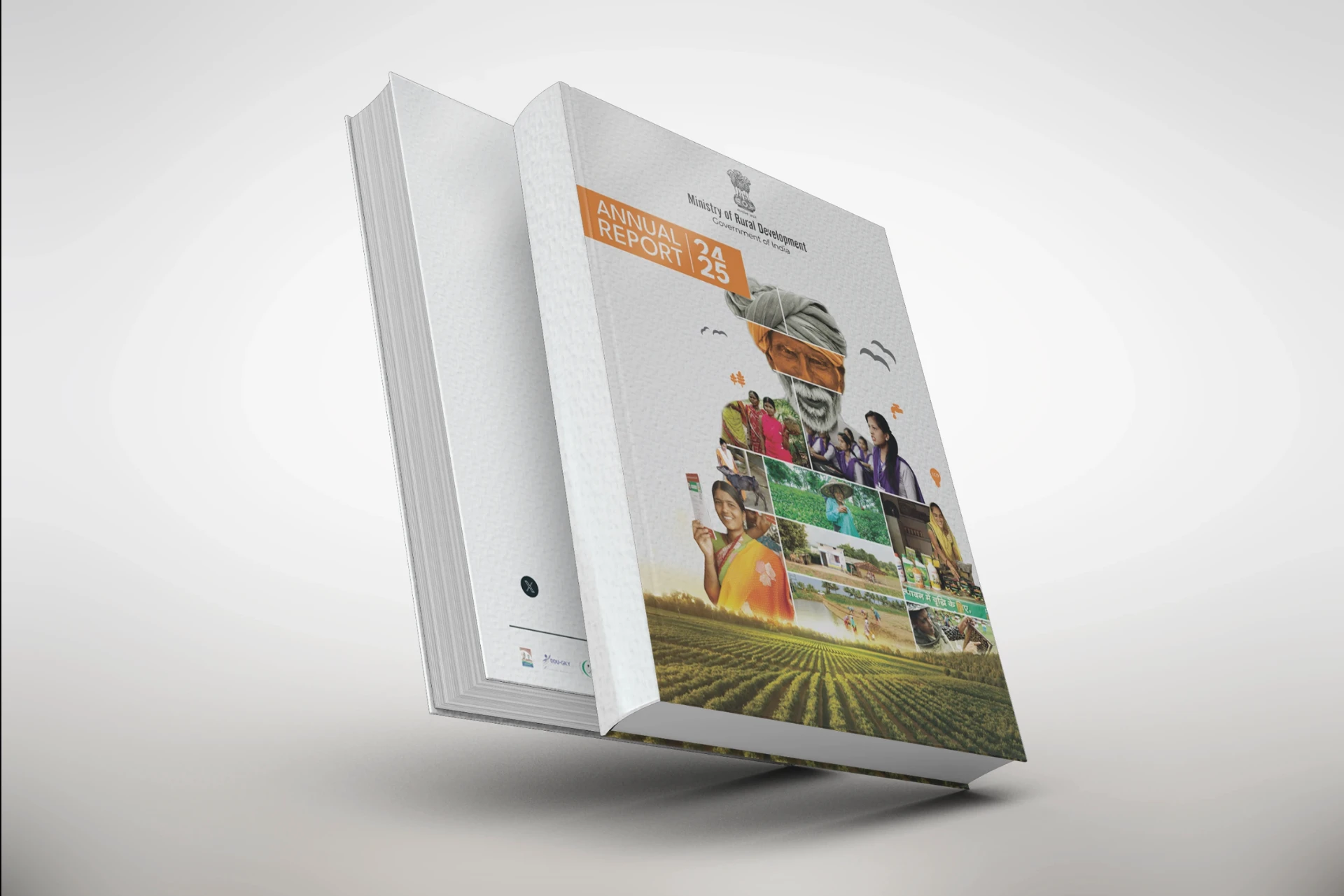
Instead of a single photograph, multiple images come together to show different aspects of rural life. A prominent central image is surrounded by rural communities, women, farmers, agriculture, housing, livelihoods and village development — gradually transitioning into a green agricultural landscape at the bottom, connecting people, initiatives and the land.
03 — Design Elements
The editorial system
Editorial Hierarchy
The orange “Annual Report 24–25” panel immediately establishes the publication title and reporting period, creating a clear entry point at the upper-left.
Government Branding
The Ministry of Rural Development identity and Government of India emblem sit prominently at the top, establishing authority and authenticity.
Image Collage
Multiple photographic panels communicate the scale and diversity of rural-development programmes — a narrative rather than decorative graphics.
Colour Palette
Orange for energy and national identity, green for agriculture and prosperity, white and grey for institutional clarity.
Typography
Clean, bold and highly legible. The condensed “ANNUAL REPORT” treatment carries an official editorial character, while the large “24 | 25” anchors the year.
04 — Colour Palette
Energy, prosperity, clarity
Report Orange
#E87E2B
Field Green
#3F7A3A
Paper White
#F4F2EE
Institutional Grey
#8C8C8C
Ink
#1E1E1E
05 — Communication Approach
UX principles, applied to print
Even as a print publication, the cover follows core UX thinking.
Clear hierarchy
Viewers understand the document type and year immediately
Visual storytelling
Imagery communicates the ministry's work before any detailed reading
Recognition
Official branding builds trust
Scannability
Major information is visible at a glance
Context
Photographs connect policy and programmes with real people and environments
06 — Design Challenge
Scale without clutter
The challenge
Representing multiple schemes, communities and development areas within a single cover while maintaining a professional government-publication aesthetic.
The solution
A structured photographic collage, controlled typography and a restrained colour system — informative and human, without becoming visually overwhelming.
07 — Final Outcome
More than an administrative document
The cover visually positions the report around people, progress, agriculture and inclusive rural development, while retaining the authority expected from an official Ministry publication.
Key takeaway
Editorial composition and visual storytelling can transform complex institutional information into an accessible visual narrative — using people and their environments as the central representation of development.
08 — My Role