Case Study — Muscle Xplod
BCAA X — Product Photography & Advertising
A visual campaign built around performance, flavour and energy — turning a sports supplement into a bold lifestyle product.
01
Project Overview
Muscle Xplod BCAA X is an essential amino acid supplement positioned for fitness enthusiasts and athletes. The objective was to create a series of high-impact product visuals communicating strength, performance and flavour while keeping the product clearly recognizable.
Rather than relying on conventional supplement advertising, I explored concept-driven compositions, dramatic lighting, bold typography and sport-focused imagery to give the product a stronger visual identity.
Category
Sports Nutrition / Fitness
Product
Muscle Xplod BCAA X
Role
Visual Designer / Creative Designer
Deliverables
Product Photography, Compositing, Advertising Creatives, Social Media Visuals
Focus
Art Direction · Product Composition · Photo Manipulation · Typography · Lighting
02
The Challenge
Sports nutrition advertising is highly competitive — gym imagery, muscular bodies, pack shots and performance messaging all look alike.
The challenge was to create visuals that felt energetic and premium without losing product clarity. The campaign had to move a viewer through a chain:
Build attention → communicate performance → highlight the product → communicate flavour.
03
Creative Direction
A visual language based on contrast and controlled hierarchy. The product stays the hero; athletes, environments and ingredients build context around it.
Bold Typography
Large, condensed headlines create immediate impact.
High Contrast
Dark environments and vibrant backgrounds make the product stand out.
Performance Imagery
Athletes communicate strength, movement and training intensity.
Flavour Association
Fresh fruit is paired with the product to make each flavour instantly recognizable.
Brand Consistency
The Muscle Xplod identity and packaging stay consistent across every composition.
04
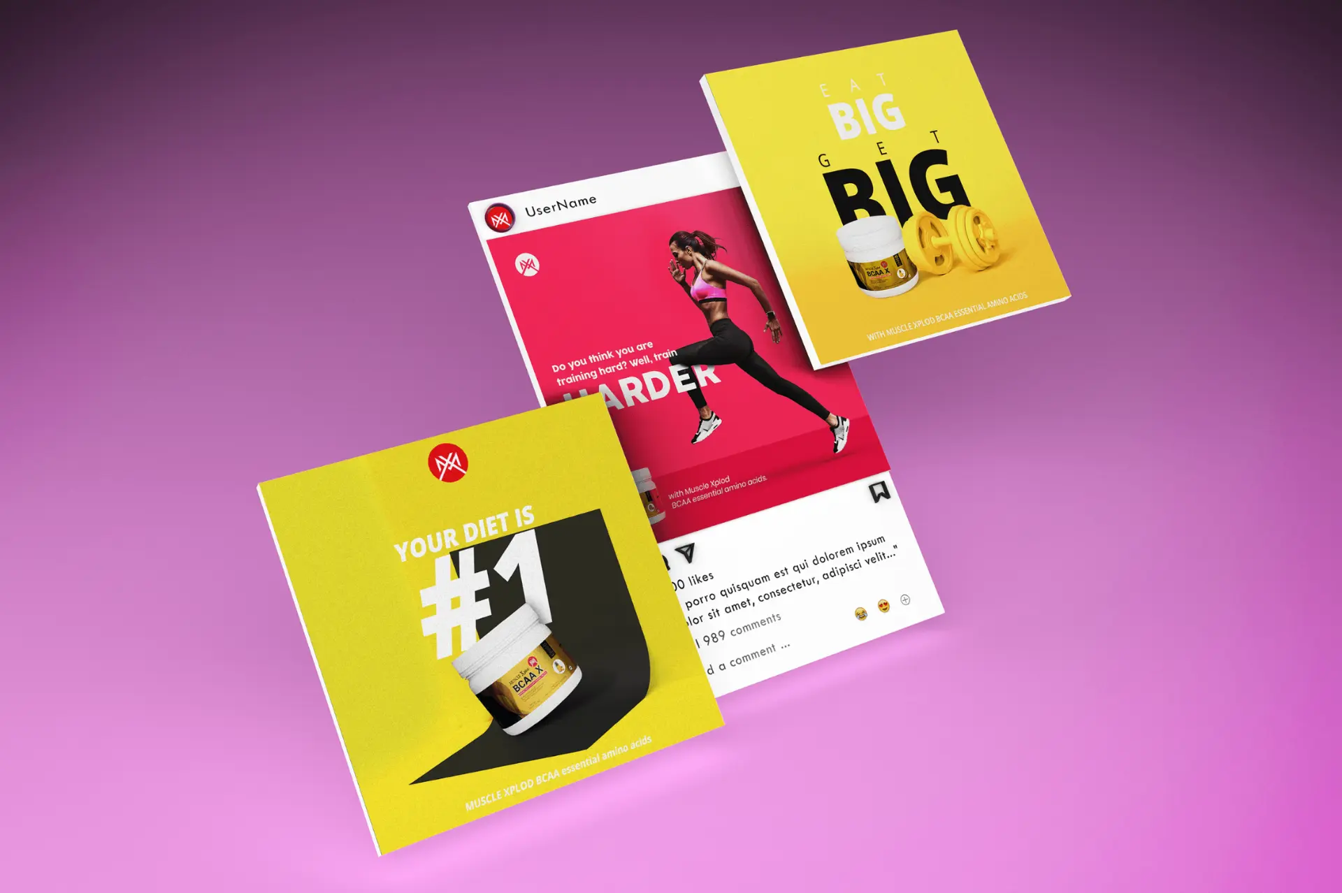
Concept — “YOUR DIET IS #1”

A bright yellow environment creates an energetic, optimistic visual. The oversized #1 becomes the main graphic element, creating depth behind the product.
The floating BCAA X container adds movement while the copy reinforces the product's role within a fitness-focused lifestyle.
Yellow environment + black geometric surface + oversized typography + floating product.
05
Concept — “EAT BIG. GET BIG.”

This composition uses scale as the primary design device. Oversized typography becomes the backdrop while the product and dumbbell establish the fitness context in the foreground.
The minimal palette keeps the composition focused and the packaging readable.
Make the message physically feel “big” through typography and scale.
06
Concept — “TRAIN HARDER”
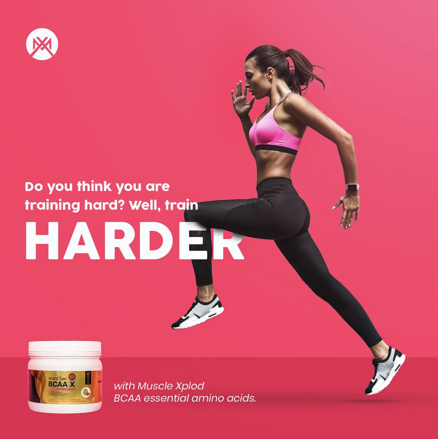
The campaign moves from product-focused communication to human performance. A running athlete creates dynamic movement across the frame, with the BCAA X pack sitting prominently at the bottom.
The pink background contrasts sharply against the athlete's dark clothing, making the creative immediately noticeable.
Key message: push beyond your current limits.
07
Concept — “WE ARE WHAT WE EAT”

A more cinematic advertising style. A stadium environment creates association with professional sport, competition and performance.
The green apple becomes the central metaphor, connecting the product with nutrition, while the copy splits across the composition: WE ARE | WHAT WE EAT.
The product sits directly in front of the apple to link nutrition and performance.
08
Concept — “BECOME UNSTOPPABLE”
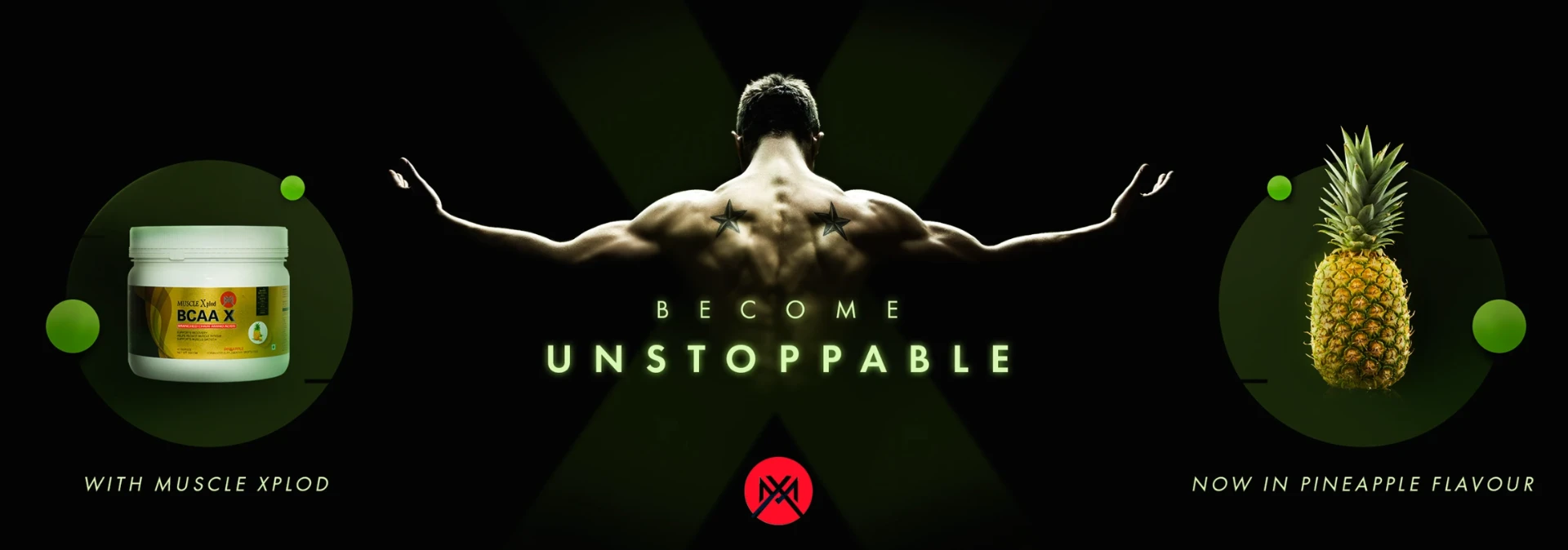
This concept focuses on strength and transformation. A muscular athlete becomes the focal point while product and pineapple sit on opposite sides.
The symmetrical composition creates a visual equation: Muscle Xplod + Performance + Flavour.
Flavour: Pineapple · dark background with green accents.
09
Concept — “TRAIN INVINCIBLE”
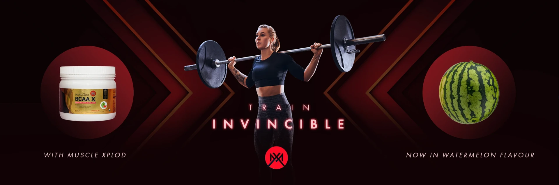
The watermelon concept introduces a red and black performance environment. A weightlifting athlete occupies the centre, surrounded by directional geometric shapes pointing toward the subject.
The directional graphics reinforce forward movement and intensity.
Flavour: Watermelon · red + black + geometric motion.
10
Concept — “PRACTICE MONSTROUS”

A dramatic cinematic sports aesthetic. Fire, particles and warm lighting build an intense environment around the athlete.
The composition says extraordinary performance requires extraordinary preparation. Product and lemon sit on opposite sides, keeping the campaign's recurring structure.
Flavour: Lemonade.
11
Concept — “BECOME YOUR BEST VERSION”
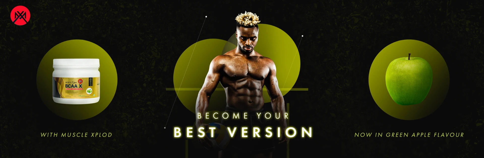
The final athlete-led concept uses a dark natural environment with green highlights. The athlete represents transformation while the green apple establishes the flavour association.
Large circular forms behind the subject provide depth and create a graphic system reusable across campaign assets.
Flavour: Green Apple.
12
Flavour System
Making each flavour visually identifiable. The fruit isn't presented as an ingredient — it becomes a visual extension of the product identity.
Pineapple
Tropical yellow + green
Watermelon
Red + dark performance tones
Lemonade
Warm yellow + orange
Green Apple
Green + lime tones
13
Product Photography
Clean product-focused visuals alongside the conceptual creatives — establishing the packaging clearly and showcasing the flavour range.
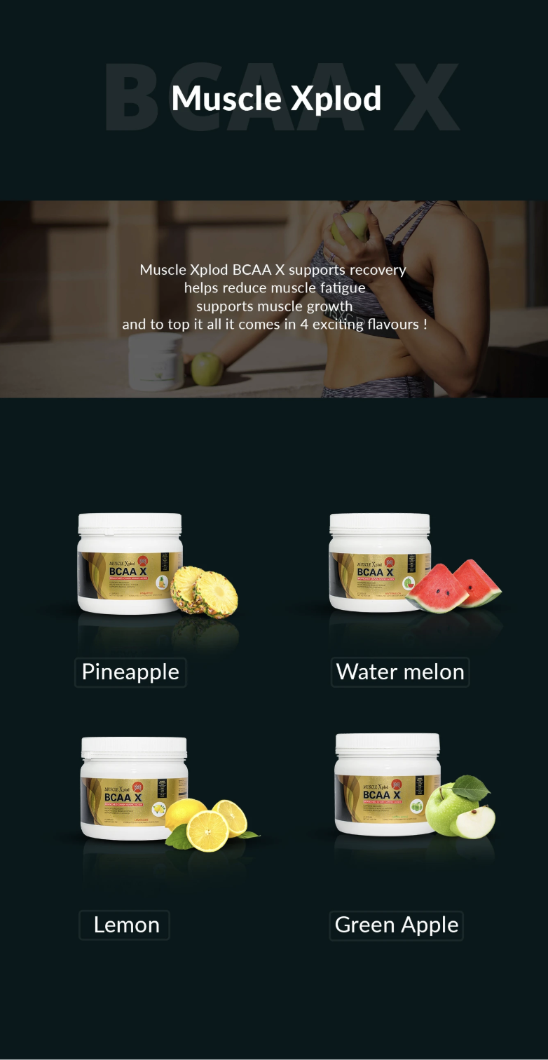
A more e-commerce and catalogue-friendly visual system compared with the campaign creatives.
14
Design Process
01
Concept
Identify the message, audience and visual metaphor.
02
Image Selection
Select athletes, sports environments, fruit and supporting imagery.
03
Product Integration
Composite the BCAA X pack with realistic scale, perspective and lighting.
04
Environment
Build backgrounds from gradients, stadiums, gyms, textures, particles and geometry.
05
Typography
Introduce oversized headlines and supporting copy to establish hierarchy.
06
Lighting & Compositing
Match highlights, shadows, reflections and colour so assets feel like one scene.
07
Final Art Direction
Balance product, athlete, headline and flavour cue into a clear focal point.
15
Visual System
A repeatable structure that let very different concepts still feel like one campaign.
16
What I Focused On
Product Visibility
The product stays recognizable even inside complex compositions.
Visual Hierarchy
Typography first, then the athlete, then the product and flavour.
Realistic Compositing
Lighting, shadows and perspective balanced to integrate the pack naturally.
Brand Recall
Repeated logo, packaging and visual language create consistency across the series.
Campaign Flexibility
One visual language across digital advertising, social and promotional creatives.
17
Outcome
The final body of work transforms a functional sports supplement into a visual lifestyle brand experience. Instead of one product shot, the campaign explores multiple interpretations of the same product:
Nutrition → Training → Strength → Competition → Transformation → Flavour
The result is a flexible collection of product and advertising visuals combining commercial product presentation with cinematic sports storytelling.
18 — Final Takeaway
The goal wasn't simply to photograph a BCAA container. It was to create a visual world around the product — one where performance, personality and flavour work together.
Fuel the performance. Define the flavour. Become your best version.