Case Study — WAVES OTT
Thumbnail & Key Art Design
A visual case study of OTT artwork across entertainment, cultural programming, national and public affairs, live events and sports — built to the DD Artwork Requirements & Guidelines v2.2.
Design objective: artwork that is instantly understandable, visually distinctive and technically adaptable across OTT discovery surfaces.
01 — Project Overview
One platform, many voices
Role: OTT thumbnail / key-art designer for WAVES OTT. Content range: films, documentaries, cultural and religious programming, public affairs, national events, sports and episodic/live content.
The challenge
Every category needs a different visual tone, but the artwork still has to remain clear, readable and consistent with the platform's submission system.
The approach
Each thumbnail is built around a simple hierarchy — hero subject → title → supporting context. The visual language changes by genre while the rules stay constant: clear focal point, controlled negative space, strong contrast and fast readability.
02 — Designing to the OTT Specification
Pixel-perfect by rule
The guideline requires both 3:4 and 16:9 thumbnails at 72 PPI in WebP, with title-safe clearances — no title within 72px of the top or 170px of the bottom on TV/web.
3:4 + 16:9
Required thumbnail ratios
WebP
Required delivery format
60 / 30 KB
TV/Web vs Mobile size limits
720×960 / 720×405
TV/web thumbnail sizes (px)
384×512 / 384×216
Mobile thumbnail sizes (px)
2048×1152
Detail banner (max 250 KB)
Design decisions
- Safe title placement: Titles get dedicated negative space, never placed over faces or key objects.
- Crop-aware composition: Hero subjects stay protected — faces, hands, monuments and objects are never unintentionally cut.
- Contrast: Tonal and colour separation keeps both title and subject legible at thumbnail scale.
- Clean backgrounds: Background detail supports the story but is controlled around the focal point.
- Format adaptation: Compositions are designed with the final crop in mind — resize is never an afterthought.
03 — Visual Language Across Categories
Same principles, different identities
OTT-first thinking produces very different visual identities per genre — while hierarchy and readability stay consistent.
Editorial / Heritage
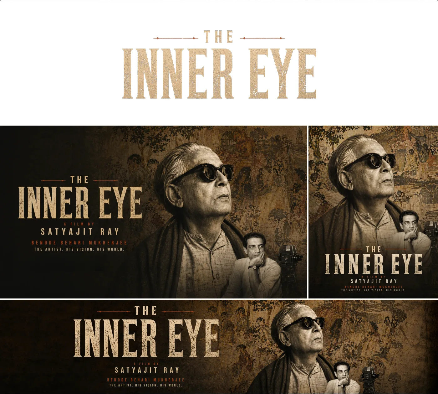
The Inner Eye
Cultural Programming
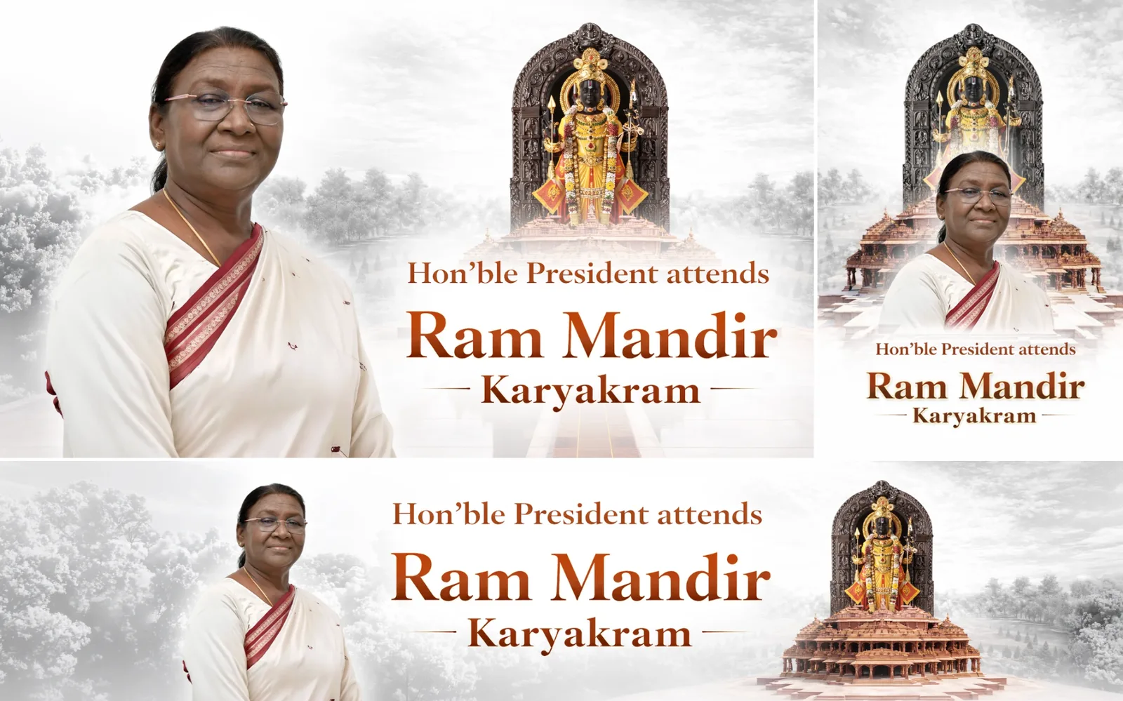
Ram Mandir Karyakram
Devotional Programming
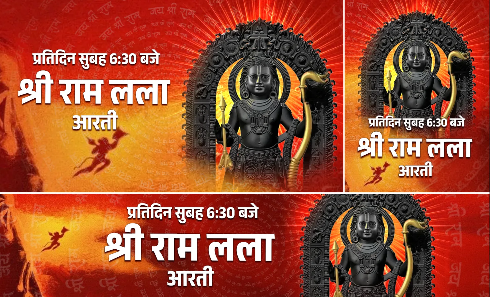
Shri Ram Lalla Aarti
Ceremonial / National Event
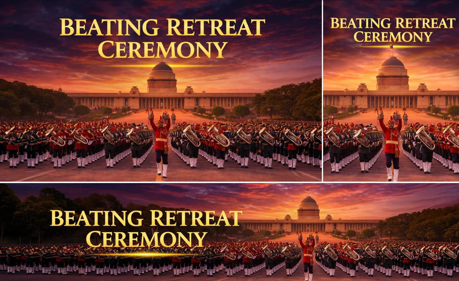
Beating Retreat Ceremony
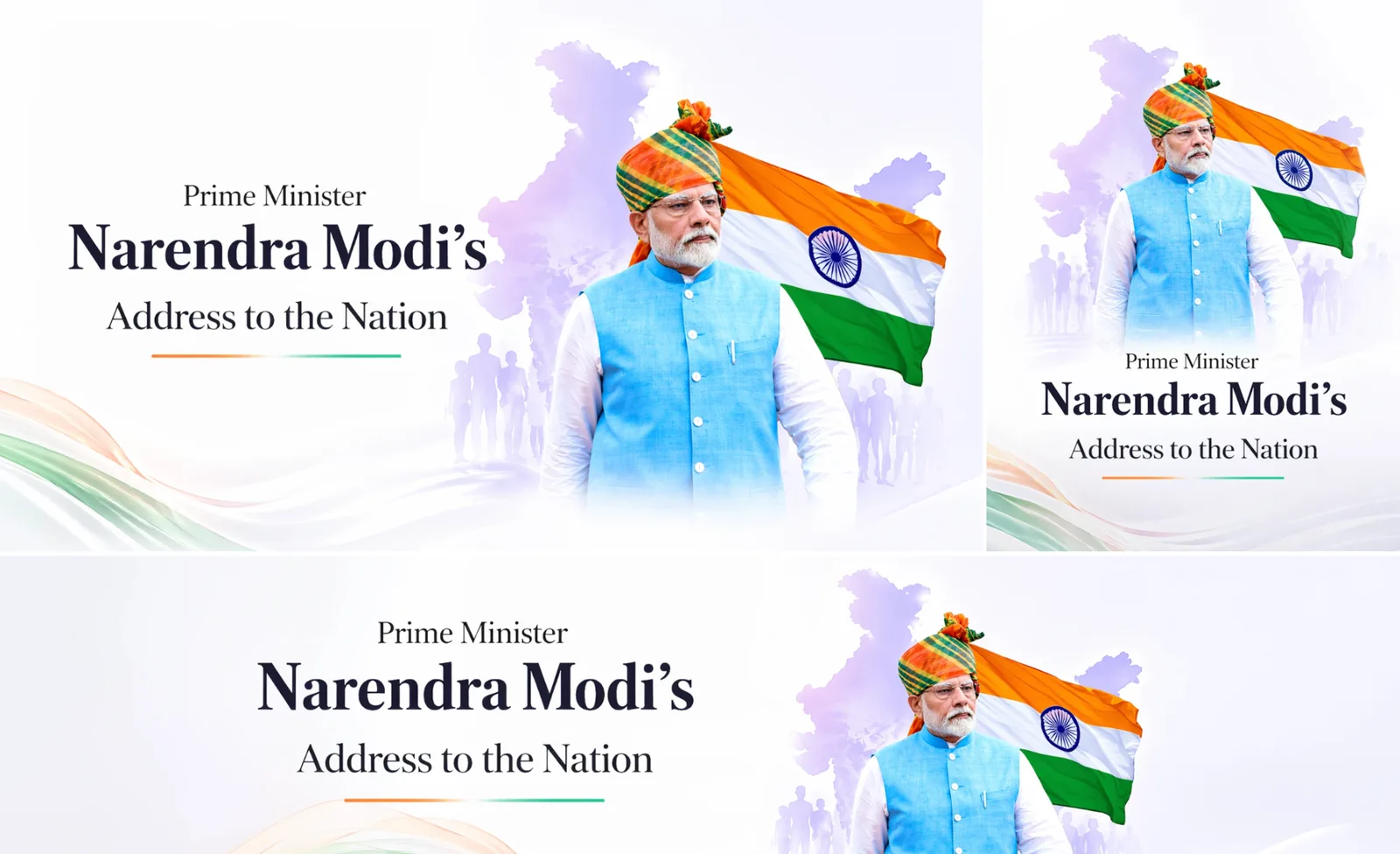
Public Affairs
PM Modi's Address to the Nation
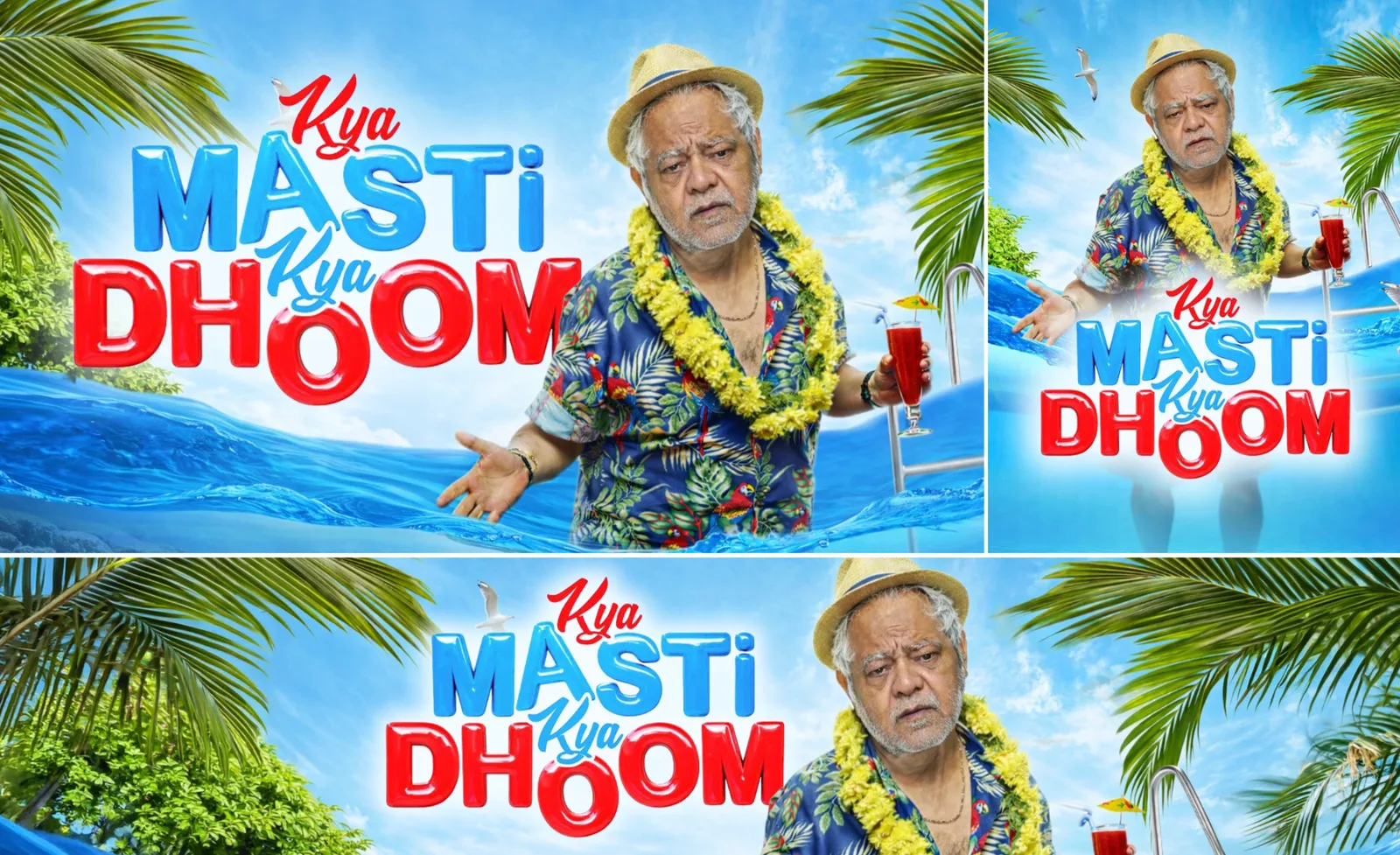
Entertainment
Kya Masti Kya Dhoom
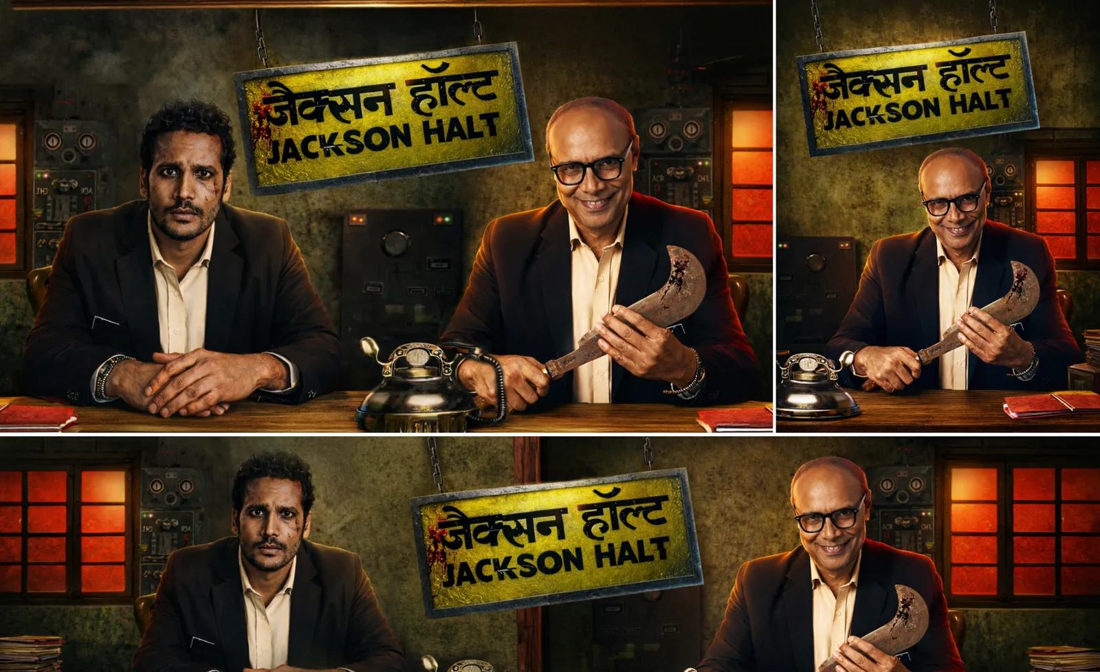
Dark Entertainment / Thriller
Jackson Halt
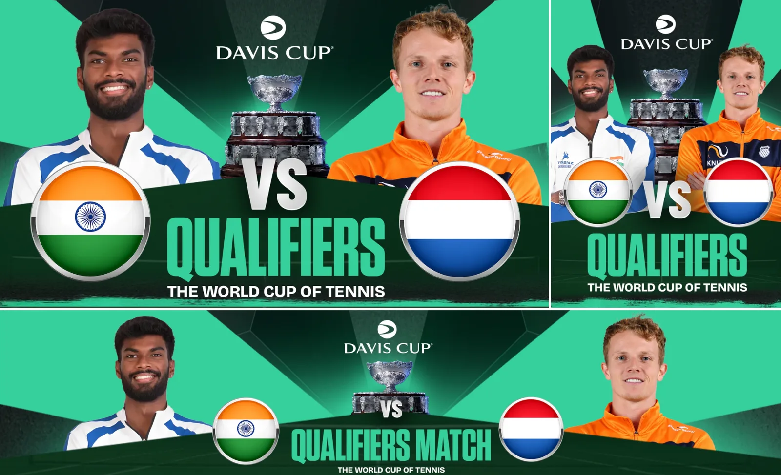
Sports
Davis Cup Qualifiers
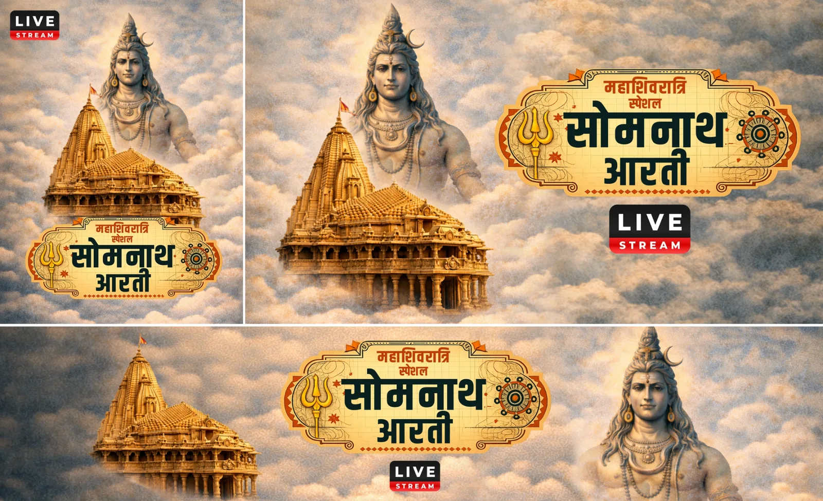
Devotional / Live
Somnath Aarti
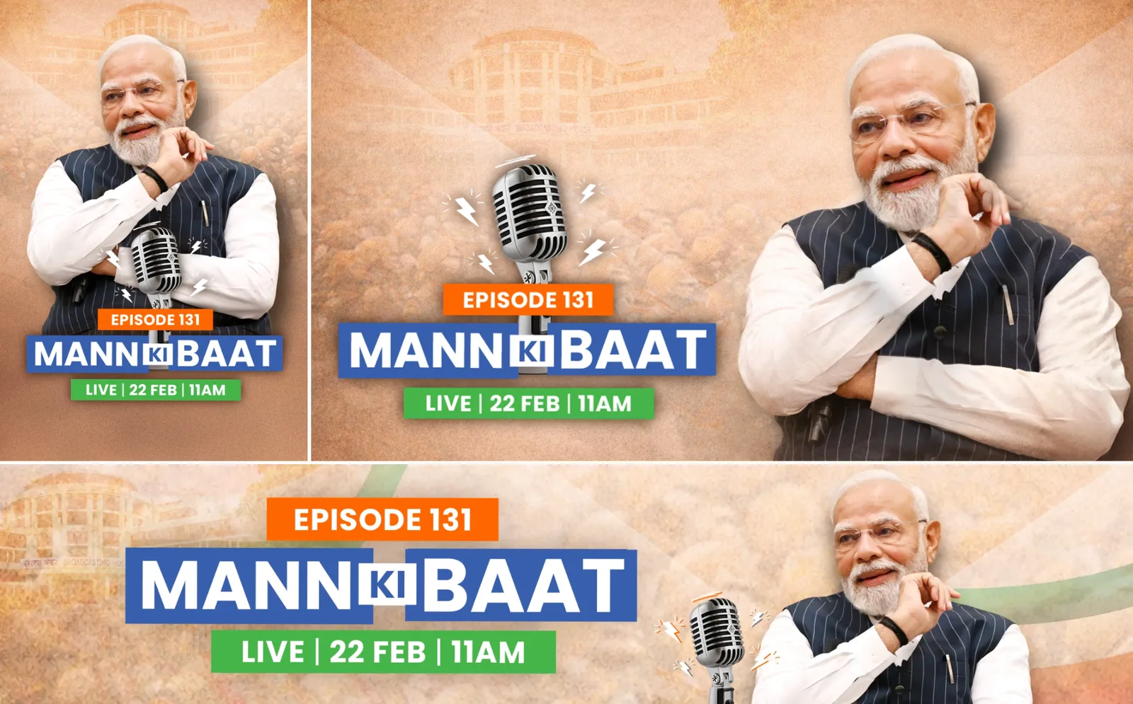
Episodic Public Affairs
Mann Ki Baat
04 — Thumbnail Workflow
From content to key art
01
Understand the content
Identify the programme, genre, key message and strongest available visual.
02
Select the hero
Choose the face, performer, monument, athlete or object that can carry the thumbnail.
03
Build hierarchy
Establish subject first, then title and only the information needed for recognition.
04
Compose for crop
Protect key subjects and plan for both 3:4 and 16:9 outcomes.
05
Polish
Improve clarity, contrast and separation without introducing visual clutter.
06
Guideline check
Review title placement, contrast, subject crop, unwanted branding and background complexity.
07
Export
Prepare WebP versions and compressed deliverables for TV/web and mobile.
05 — Outcome & Takeaway
A repeatable system, not a fixed style
The visual system adapts to editorial, entertainment, cultural, public-affairs, live-event and sports content while keeping hierarchy and readability consistent.
- Fast, thumbnail-scale visual communication
- Category-aware art direction instead of one universal template
- Intentional negative space for titles and responsive cropping
- Strong subject/background separation
- Design decisions grounded in platform delivery requirements
- No title obstruction, low contrast, key-subject cut-offs, blur, unwanted logos or cluttered backgrounds
Instantly understandable. Visually distinctive. Technically adaptable.
More projects →