Case Study — SK Entertainment
A bold entertainment identity built for the social generation
SK is the brand. The TV is the entertainment. Red brings the energy.
01
Brand Overview
SK Entertainment is a digital-first entertainment identity created for content around celebrities, music, television, movies, pop culture and trending stories.
The visual identity needs to work in a fast-scrolling social environment, where the logo must be recognizable, energetic and readable at a glance.
02
The Core Idea
SK + TV + Entertainment — a recognizable SK identity transformed into an entertainment channel.
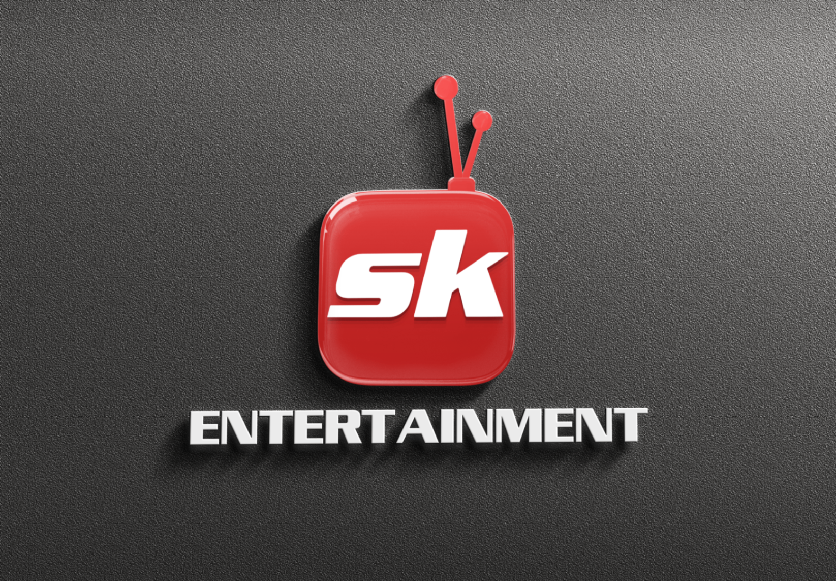
The logo combines the familiar SK monogram with a television-inspired form. The TV silhouette makes the purpose of the brand immediately understandable without making the logo visually complicated.
03
Logo Anatomy
SK Monogram
The central element provides instant brand recognition and connects the entertainment vertical to the larger SK identity.
TV Form
The rounded television shape establishes the connection with broadcasting, shows and entertainment.
Antenna
A playful broadcast reference that makes the symbol more distinctive.
Entertainment Descriptor
The word ENTERTAINMENT clearly defines the vertical and gives the identity a complete lock-up.
04
Brand Architecture
A simple hierarchy that lets every type of entertainment content live under one recognizable visual brand.
SK
Brand Recognition
ENTERTAINMENT
Content Vertical
CONTENT
Movies · TV · Music · Celebrities · Pop Culture · Trends
05
Colour Strategy
Red
Creates energy, excitement and strong social-media visibility.
White
Provides clarity, contrast and a clean visual balance.
Black / Dark Tones
Support headlines, backgrounds and dramatic entertainment imagery.
06
Typography
Bold, condensed typography for headlines — because entertainment content needs to communicate quickly.
Large headlines also create a consistent connection between the logo and social-media artwork.
07
Visual Language
The logo extends naturally into the content design system.
Large Imagery
Celebrity and entertainment subjects remain the visual focus.
Bold Headlines
Short, powerful headlines capture attention quickly.
Red Accents
Frames, borders and graphic elements reinforce brand recognition.
Dark Gradients
Improve headline readability while adding a cinematic feel.
Strong Compositions
Split layouts, framed images and layered graphics create variety without losing the brand identity.
08
Social Media Behaviour
The logo works as a channel-style watermark — consistently positioned in the corner while the main artwork changes with the story.
The content can change. The brand recognition stays constant.
Whether the story is about a celebrity, a movie, a singer or a viral moment, the SK Entertainment mark provides continuity.
09
Brand Personality
Bold
Strong red and typography.
Young
Social-first visual language.
Energetic
High-contrast compositions.
Fun
TV-inspired logo.
Current
Celebrity and trending content.
10
What Makes the Logo Effective
Memorable
The combination of SK + TV silhouette creates a distinctive symbol.
Recognizable
The red icon remains visible even at small sizes.
Flexible
It works across social posts, videos, profiles and digital platforms.
Relevant
The TV reference immediately connects the brand with entertainment.
Scalable
The icon works independently when the full wordmark is too small.
11
Recommended Logo System
Primary Logo
SK TV Icon + ENTERTAINMENT — for social media, editorial graphics, website and marketing material.
Icon
SK TV Symbol — for profile pictures, video watermarks, reels/shorts and small digital applications.
Monochrome
Black / White version — for special backgrounds, print and single-colour applications.
12
Brand Opportunity
The concept is already strong. The biggest opportunity is not to redesign it — but to build a more consistent system around it.
This would make every SK Entertainment communication feel like part of the same brand.
Final Brand Thought
A digital entertainment channel built for the social generation.
The identity succeeds because it communicates the brand in one simple visual statement: SK is the brand. The TV is the entertainment. Red brings the energy.
Start a conversation