Hospitality · Brand Communication · Case Study
Sukoon Saat
by The Hostalgic
Turning a Himalayan treehouse into an experience-led hospitality brand.
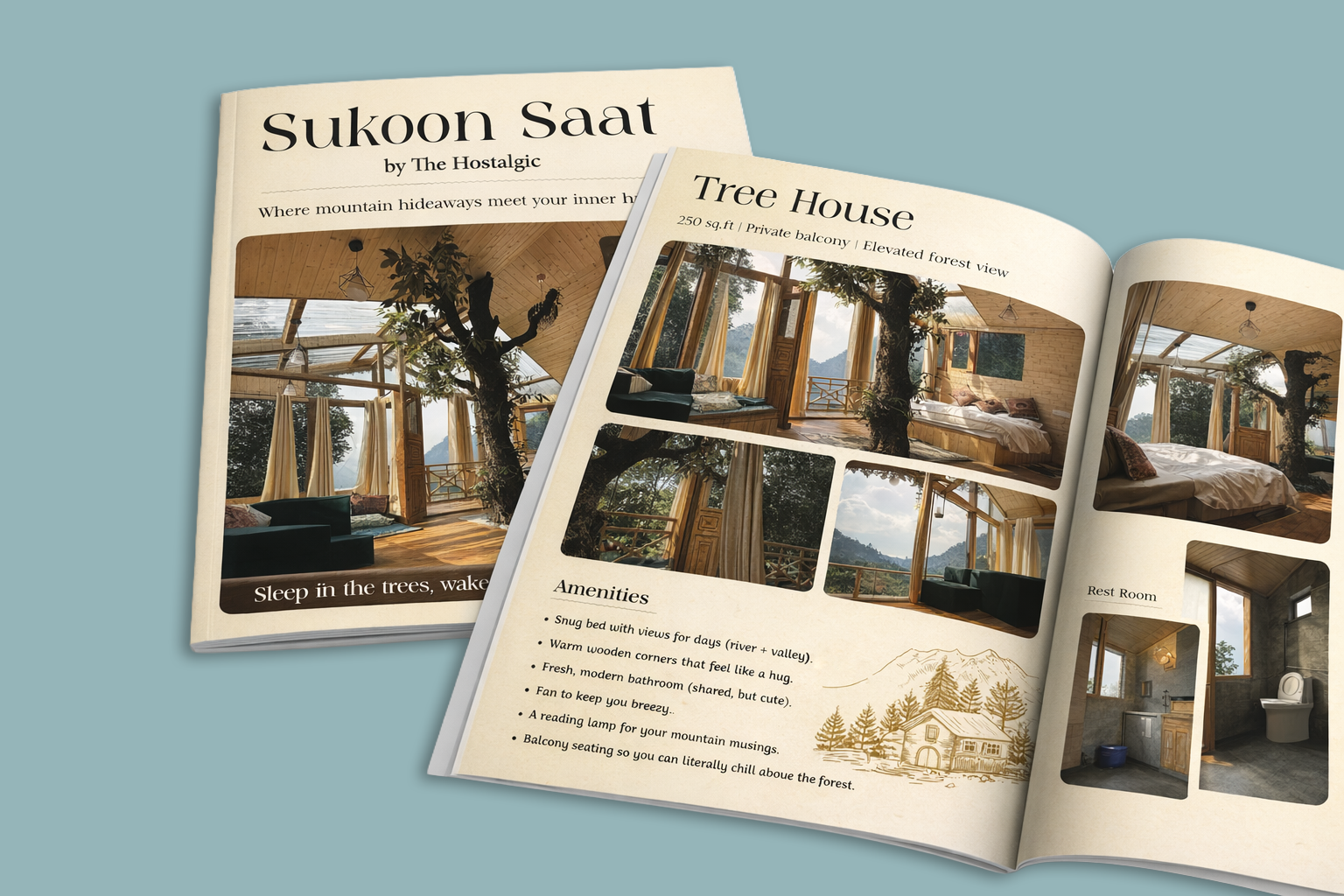
Cover and Tree House spread — brochure presentation.
01
The Brand
A treehouse stay by The Hostalgic, positioned around escaping into the mountains while retaining warmth and comfort.
Client: The Hostalgic · Property: Sukoon Saat Tree House · Location: Tandi, near Jibhi, Himachal Pradesh · Category: Hospitality / Travel / Mountain Stay
My role: Brand Communication · Art Direction · Editorial Design · Visual Storytelling · Content Structuring
The core proposition is expressed through lines such as “Where Mountain Escapes Meet Bohemian Comfort” and “Sleep in the trees, wake with the breeze.”
Treehouse accommodation
An elevated stay built around a living tree.
Mountain & valley views
River and valley panoramas from the private balcony.
Guided treks
Woodland trails, riversides and village secrets.
Local dining
Pahadi goodness, served fireside.
Bonfire experiences
Evenings built around the fire.
Community spaces
A relaxed, bohemian, social atmosphere.
02
The Challenge
The property has a naturally strong visual proposition — the treehouse, wood interiors, mountains and outdoor lifestyle — but the experience needed to be communicated as more than just a room for rent.
The objective
Make the viewer feel “I want to be there” before they even reach the booking information.
Rather than presenting amenities and photographs, the brochure was approached as an experience-led brand story answering one question: why should someone stay here?
03
My Approach — Stay. Roam. Belong.
The communication was structured around three layers of the experience, moving the brochure away from a conventional hotel catalogue and toward an editorial travel experience.
STAY
The physical experience of the treehouse.
ROAM
The surrounding mountains, trails, villages and nature.
BELONG
Food, bonfires, conversations and fellow travellers.
04
Visual Direction
A visual language connecting the property with its Himalayan environment.
Colour
A restrained warm cream + earthy ochre/golden palette supported by natural photography — organic, premium and calm.
Typography
An elegant editorial serif with smaller supporting text — boutique travel character, not a generic hotel brochure.
Illustration
A hand-drawn Himalayan landscape repeated across pages — shorthand for Himalayas, nature, escape and slow living.
Wood
Warmth of the treehouse interiors.
Sunlight
Natural light as a storytelling element.
Mountains
The Himalayan setting.
Paper
An editorial, handcrafted feel.
Slow travel
Organic, premium and calm — never saturated.
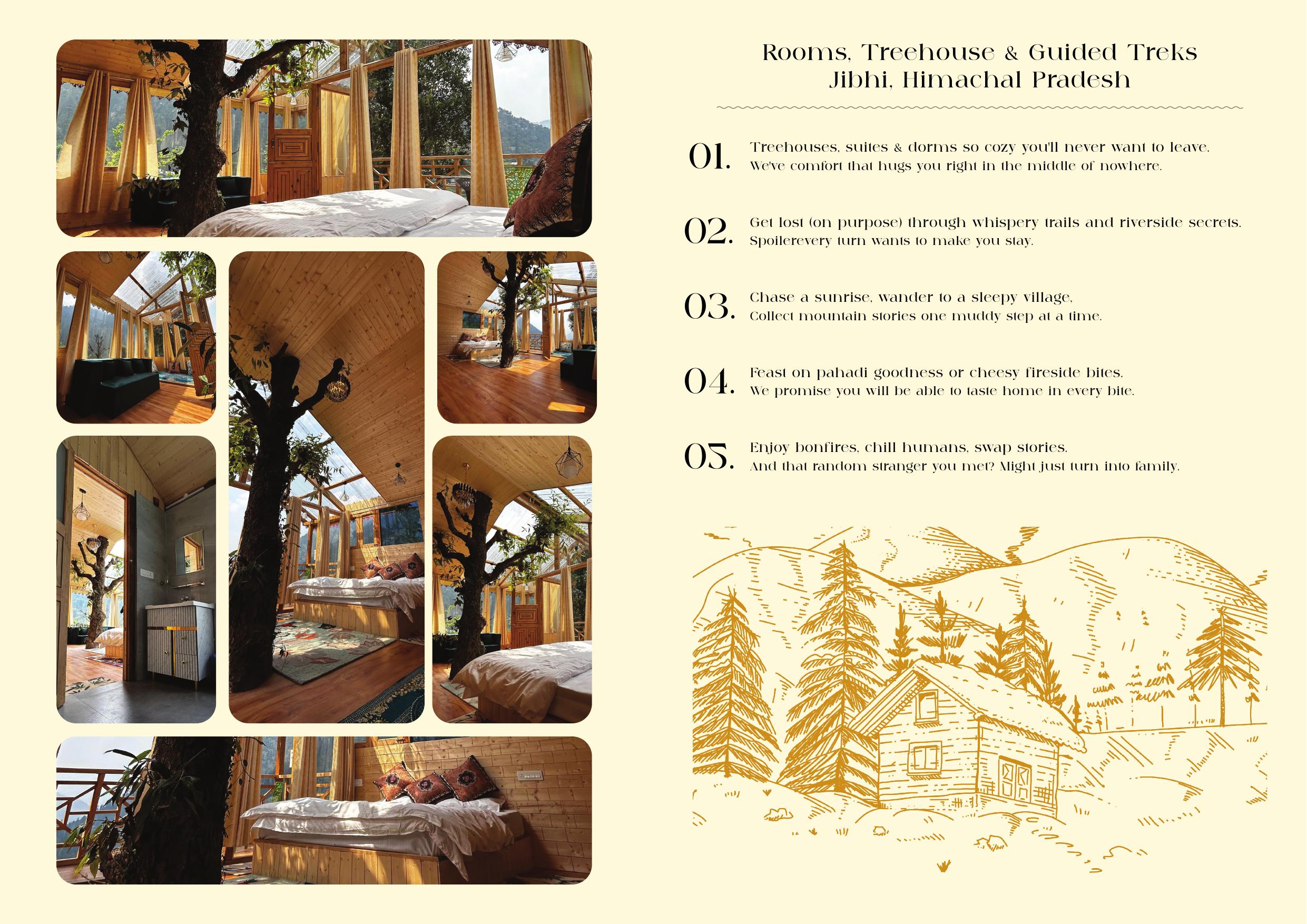
“Where Mountain Escapes Meet Bohemian Comfort” — illustration as a recurring visual device.
05
Photography Art Direction
Photography treated as a storytelling element, not supporting content — an editorial collage that lets the viewer move through the property.
The living tree
Growing straight through the interior.
Wooden architecture
Warm corners and natural materials.
Valley views
Balcony, light and landscape.
Room details
Bed, food, coffee and texture.
Editorial collage
Multiple frames that let you move through the property.
06
Content Architecture
The brochure is organised into a clear visitor journey.
01 — Introduction
What is Sukoon Saat? Hero imagery establishes the emotional proposition.
02 — Experience
Treehouses, trails, treks, food and bonfires introduced as experiences, not a list of services.
03 — Brand story
Why this place feels different — slowing down, exploring, feeling at home.
04 — Room
The Tree House broken down: size, balcony, views and amenities.
05 — Dining + Location
Dining, contact and travel directions complete the decision-making journey.
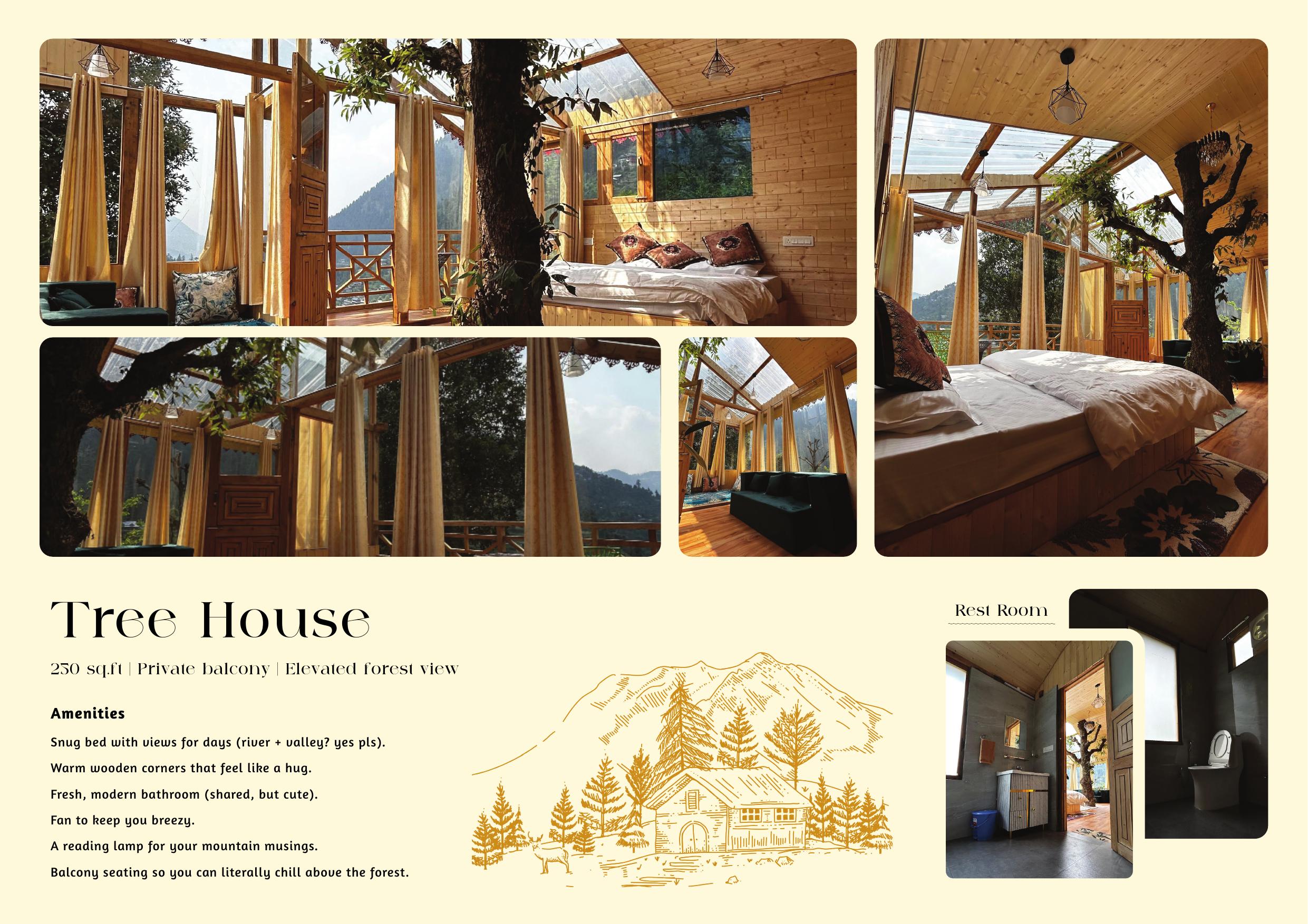
Experiences presented as a journey, not a list of services.
07
Copy & Brand Voice
The two brochure versions show an evolution — from refined, premium hospitality toward a warmer, youthful, bohemian personality.
Version A — Refined
“Where Mountain Escapes Meet Bohemian Comfort.” A polished hospitality tone.
Version B — Bohemian
“Where mountain hideaways meet your inner hippie.” Conversational lines like “Get lost (on purpose)” and “plot twist in your travel story.”
Why it matters
The brand shifts from “a beautiful place to stay” to “a place with a personality” — relevant to younger travellers, backpackers and experience-led tourists.
08
Editorial Layout System
One consistent system — large headline → supporting copy → photography → information → illustration — balancing emotion and information so neither dominates.
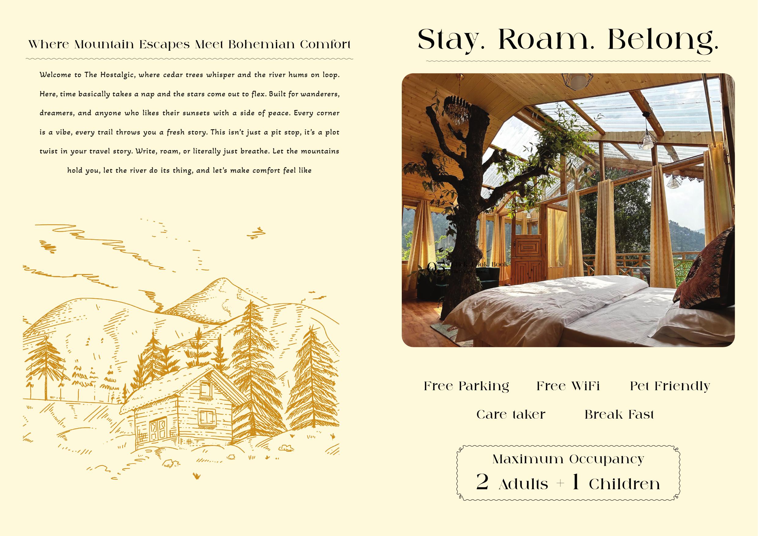
The room page: a large image collage balanced with concise information and the Himalayan illustration.
09
Information Design
Practical booking information separated from emotional storytelling — the brochure serves two purposes: Inspire → Inform → Convert.
Amenities
Free parking · Free Wi-Fi · Pet friendly · Caretaker · Breakfast.
Accommodation
250 sq.ft. · Private balcony · Elevated forest view · Double bed · River & valley views.
Travel
Aut Bus Stand — 28 km · Jibhi Village drop point — 1.1 km · Kullu–Manali Airport — 37 km.
10
Before & After Direction
Before
Room + Amenities + Location + Contact
This tells people what exists.
After
Mood + Story + Experience + Personality + Product + Journey
This tells people why they should care.
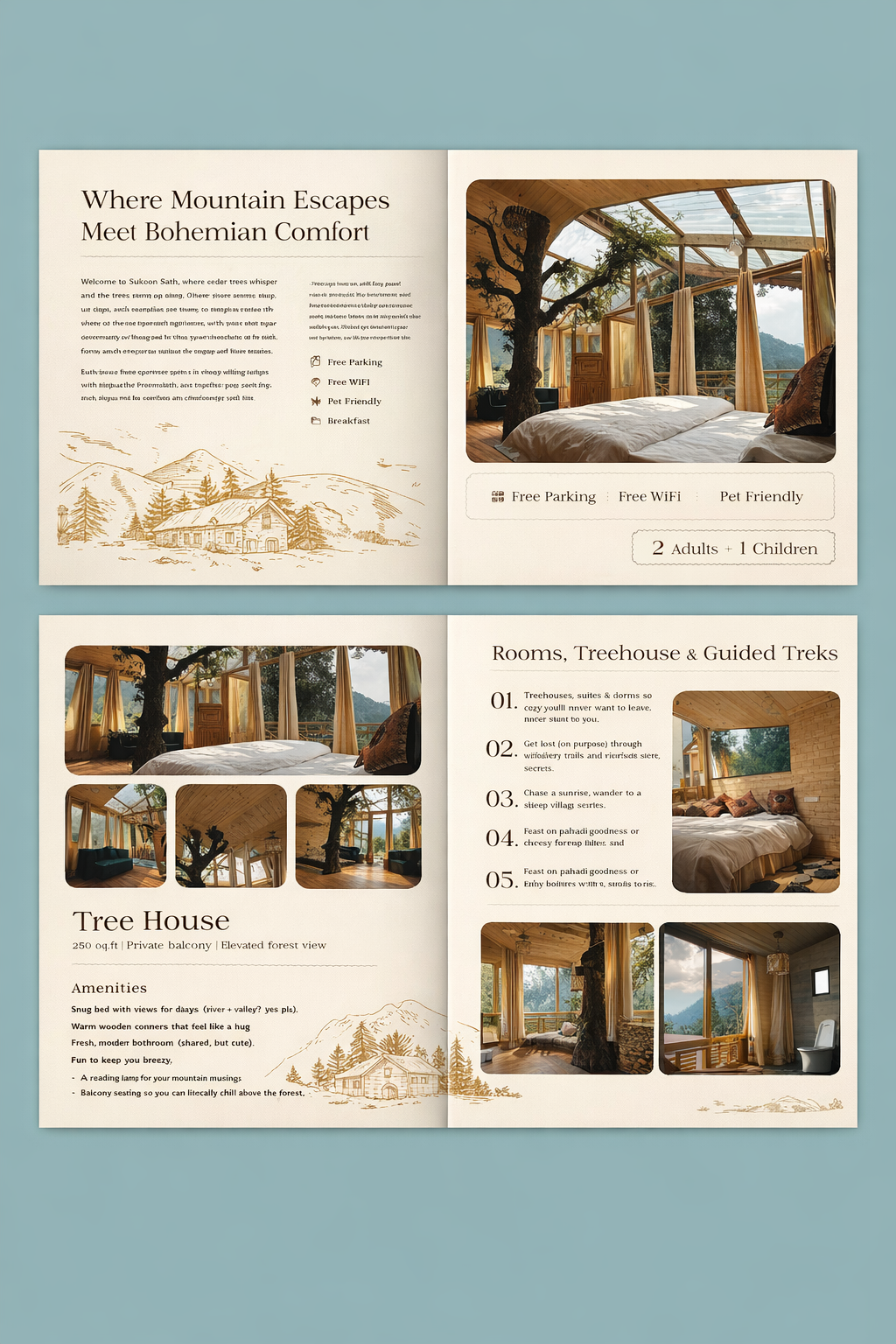
The brochure system — one cohesive brand asset across five pages.
11
What I Worked On
Brand Communication
Communication direction for Sukoon Saat within The Hostalgic's hospitality ecosystem.
Art Direction
Visual mood through photography, composition, typography, colour and illustration.
Editorial Design
The five-page property brochure as an editorial-style hospitality experience.
Content Structuring
A logical customer journey — discovery to accommodation, dining, travel and booking.
Brand Voice
From refined mountain hospitality toward a warmer, youthful, bohemian personality.
Visual Storytelling
Photography and illustration communicating the feeling of staying there — not just documenting it.
Information Design
Clear sections for rooms, amenities, dining, location and travel.
12
The Design Philosophy
“Don't sell the room. Sell the feeling of waking up in the mountains.”
The treehouse
becomes the hero.
The photography
establishes desire.
The illustrations
establish place.
The typography
establishes personality.
The copy
establishes emotion.
The information design
removes friction from the booking decision.
13
Final Brand Expression
Sukoon Saat positioned as an experience rather than simply accommodation.
SLEEP
in the trees.
WAKE
with the breeze.
ROAM
through the mountains.
EAT
local and fireside.
BELONG
around the bonfire.
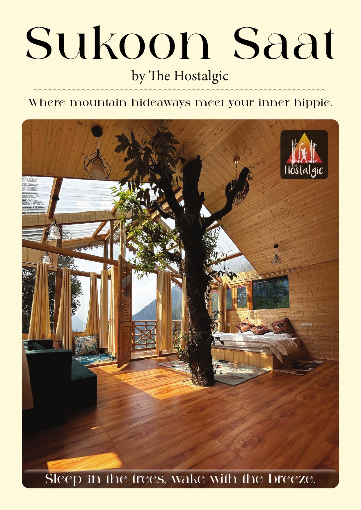
Cover — “Sleep in the trees, wake with the breeze.”
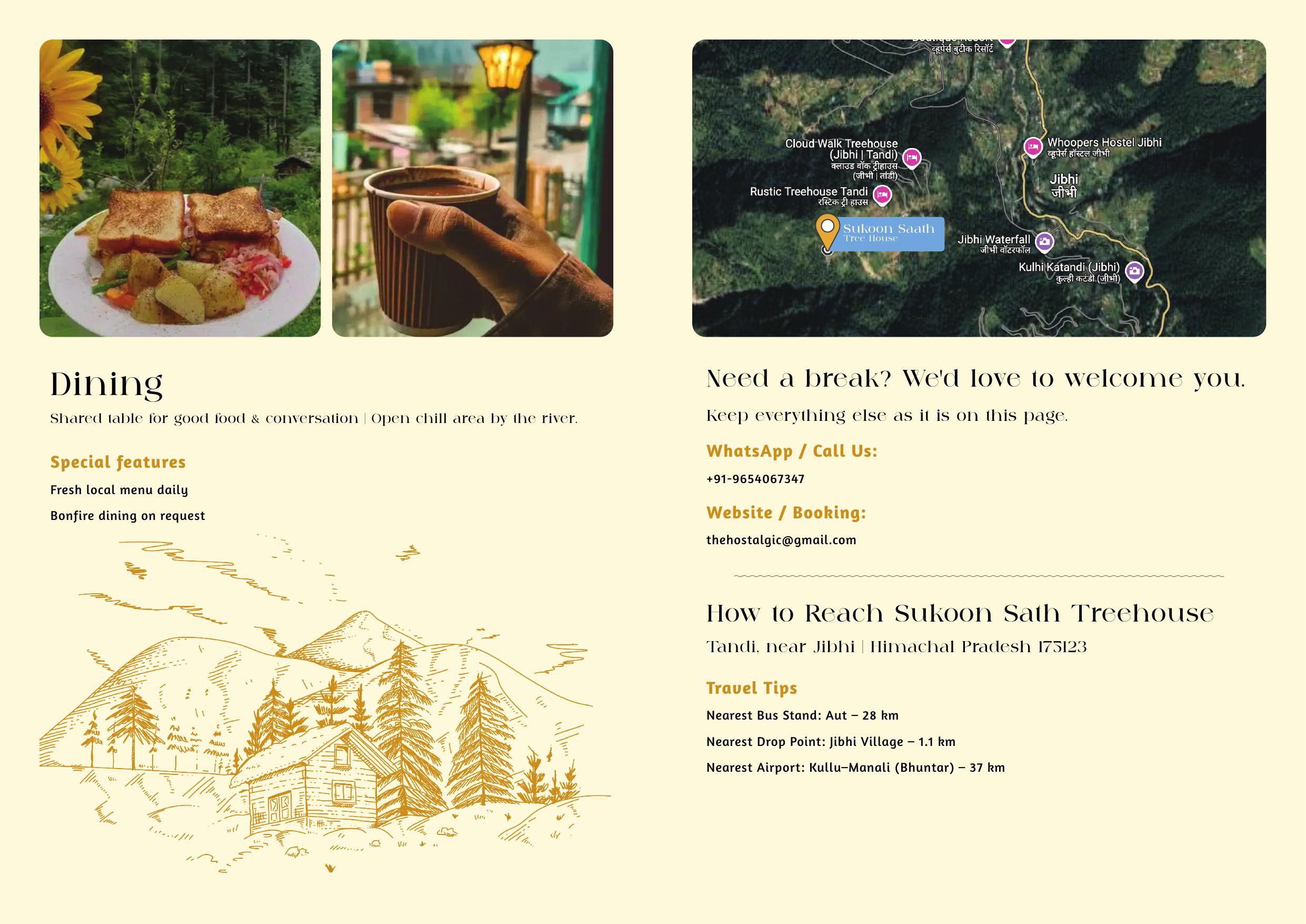
Closing page — dining, location and travel complete the journey.
In one line
A five-page hospitality brochure that balances emotion, storytelling and practical information — making the property feel less like a room to book and more like an experience worth travelling for.