Brand Identity · Case Study
Tech2Globe
From a conventional technology identity to a modern, global brand system.
01
Project Overview
Brand: Tech2Globe · Industry: Technology / IT / Digital Solutions · Project Type: Brand identity improvement and visual communication redesign.
Tech2Globe already had a clear brand name and a strong idea behind it: Technology + Global connectivity. However, the original identity relied heavily on a basic wordmark, strong red-and-black colours, and a globe symbol.
The improvement focused on making the brand feel more modern, professional, scalable and internationally relevant, while retaining the recognition of the original name and concept.
02
Before — Existing Identity
The original Tech2Globe logo used a red “Tech”, black “Globe”, a red globe illustration, a horizontal underline, and the tagline “you authorize, we improvise!!”
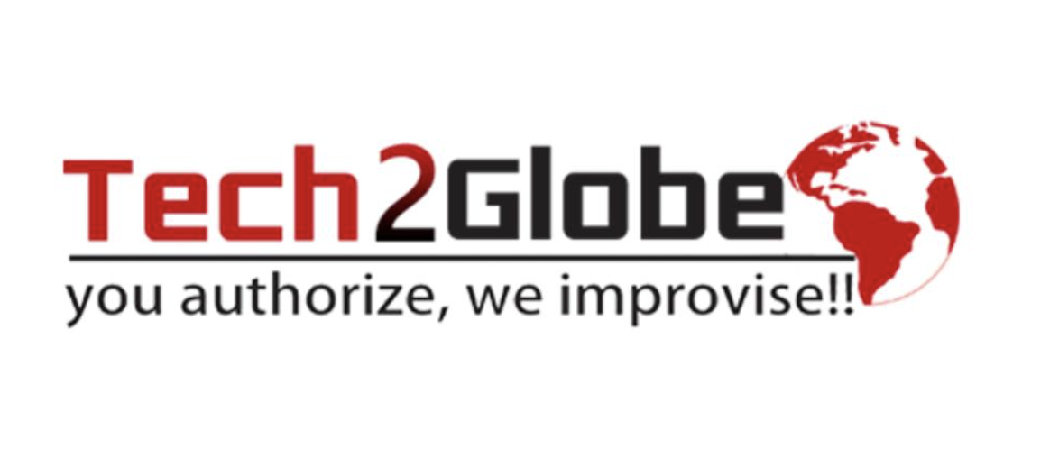
Original Tech2Globe logo.
Clear brand name
“Tech2Globe” immediately communicates technology and international reach.
Strong concept
The globe provides an obvious connection to global business.
Good colour contrast
Red and black make the logo highly visible.
Memorable symbol
The globe gives the wordmark a recognisable visual element.
03
Before — Problems Identified
Although the original identity communicated the basic idea, it had limitations from a modern branding perspective.
The logo felt dated
Heavy typeface, underline and detailed globe illustration created a traditional corporate appearance.
Too much visual weight
The globe competed with the wordmark instead of integrating with it.
Limited colour flexibility
Strong red and black offered few possibilities for sophisticated digital and corporate applications.
Weak visual system
The logo existed as an isolated mark — no system for typography, icons, shapes, colour hierarchy, layout or marketing materials.
Hard to feel premium
The mark identified the company but didn't communicate innovation, scalability, global connectivity or digital expertise.
04
Design Challenge
How can we modernise Tech2Globe without losing the meaning and recognition of the existing brand? The solution was not to abandon the original concept — instead, the identity was developed around three existing brand ideas.
TECH
Technology, innovation and digital expertise.
2
Connection, transition and movement from technology toward global solutions.
GLOBE
International reach, connectivity and worldwide business.
05
After — Improved Visual Direction
The improved direction introduces a cleaner, lighter and more contemporary technology aesthetic. The logo becomes less dependent on the large globe illustration and instead uses the “O” in Globe as an opportunity for a circular/global visual language.
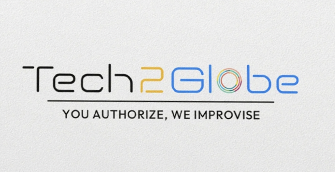
Improved Tech2Globe identity.
Before: Globe = separate graphic attached to the wordmark.
After: Global connectivity = integrated into the overall identity. This makes the identity easier to use across different formats.
06
After — Colour Strategy
Instead of depending entirely on red and black, the improved identity introduces a broader technology-inspired palette — allowing Tech2Globe to move from a single-logo identity toward a complete visual language.
Blue
Technology, trust, intelligence and professionalism.
Orange / Yellow
Innovation, energy, creativity and progress.
Green
Growth, development and sustainability.
Black / Dark Grey
Authority, contrast and corporate sophistication.
White
Clean space, clarity and modernity.
07
Typography Improvement
The visual direction moves toward a cleaner, modern sans-serif style.
Before
Heavy, bold, more conventional and visually dominant typography.
After
Clean letterforms, better spacing, lighter visual weight, strong readability and digital compatibility — appropriate for websites, apps, presentations, corporate documents, social media and digital advertising.
08
Building a Visual Language
One of the biggest improvements is moving beyond the logo.
Circular forms
Representing the globe, connectivity and digital networks.
Curved lines
Representing movement and continuous technological development.
Gradient transitions
Representing innovation and the connection between technologies.
Modular cards
Presenting services, statistics, clients, certifications and case studies.
Icons
Simple icons make complex technology services easier to understand.
09
Before vs After
| Element | Before | After |
|---|---|---|
| Logo | Traditional wordmark + globe | Cleaner, more integrated identity |
| Typography | Heavy and conventional | Modern and lightweight |
| Colour | Mainly red + black | Flexible technology palette |
| Globe | Separate illustration | Integrated global concept |
| Layout | Basic corporate structure | Modular and organised |
| Graphics | Limited | Icons, curves and digital forms |
| Information | Text-heavy | Visual information hierarchy |
| Applications | Mainly logo-based | Complete brand system |
| Brand feel | Traditional IT company | Modern global technology company |
| Digital use | Limited flexibility | Designed for digital platforms |
10
Brochure / Marketing Communication
The brochure direction demonstrates how the identity can be extended into a complete communication system — information organised into visual sections, faster to scan and easier to understand.
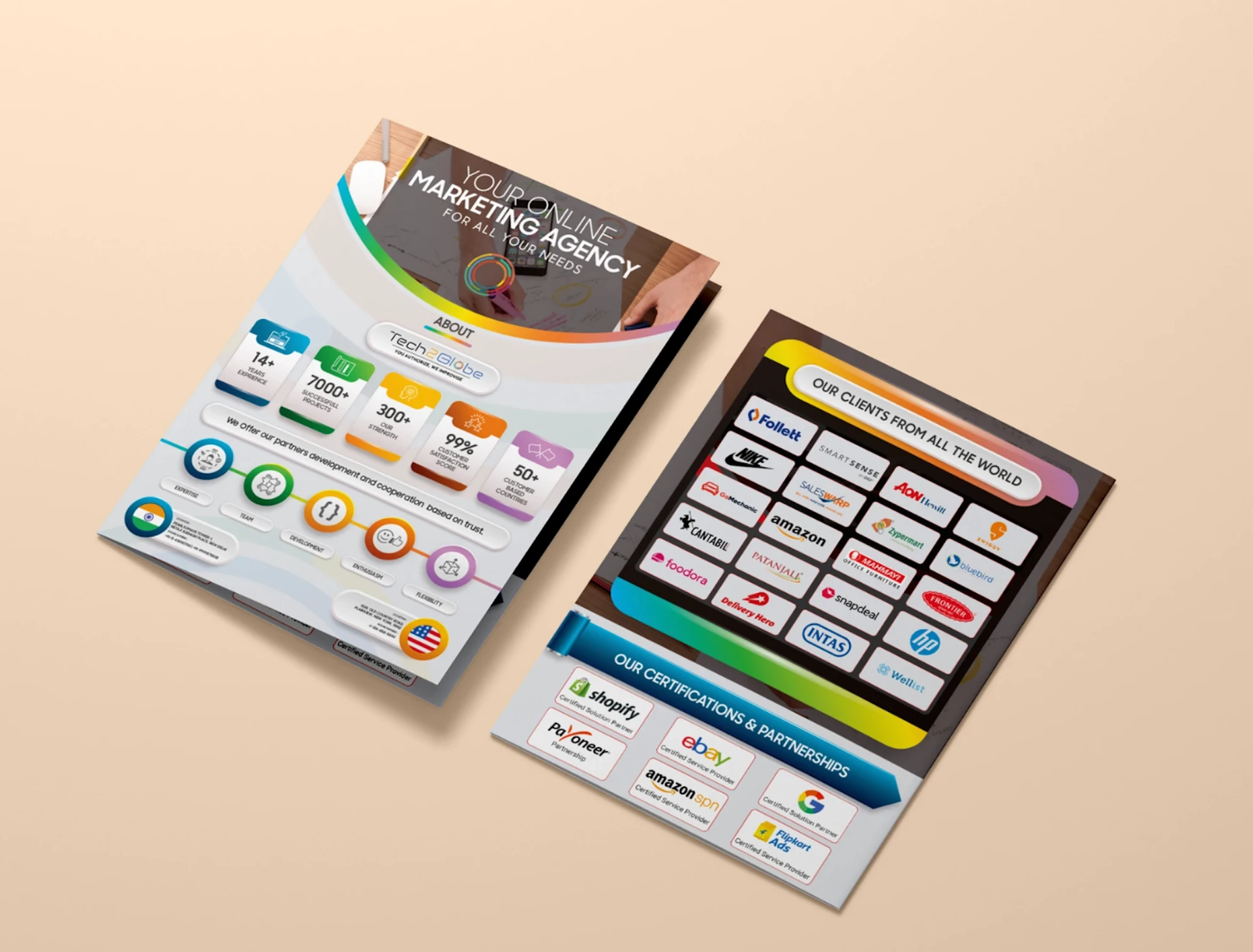
Company flyers — statistics, services, clients and certifications.
Hero Section
Large visual + strong headline.
About the Company
Short introduction and brand positioning.
Key Statistics
Important numbers displayed visually.
Services
Icons + short descriptions.
Global Reach
Countries, clients or locations represented visually.
Certifications & Partnerships
Logos arranged in a consistent grid.
Call to Action
Clear contact information.
11
Information Design Improvement
Converting large amounts of corporate information into visual communication: Paragraph → Paragraph → Paragraph becomes Icon → Heading → Short description → Supporting information.
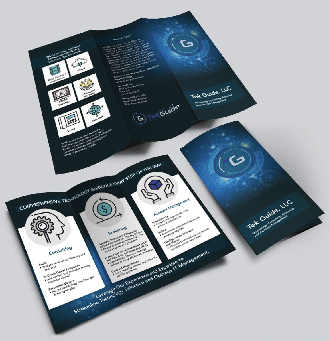
Brochure system — icon-led service communication.
Consulting
Technology assessment, strategy and business recommendations.
Brokering
Technology sourcing, vendor comparison and procurement support.
Account Management
Implementation, billing and ongoing technology management.
12
Business Card Application
A strong business card should communicate the brand in a very small space — clean white space, logo prominence, limited colour accents, clear hierarchy, minimal contact information and consistent typography create a premium first impression.
13
Corporate Signage
The building signage demonstrates scalability — a good identity must work both at a small size and at architectural scale, from business cards to brochures to websites to office signage without losing recognition.
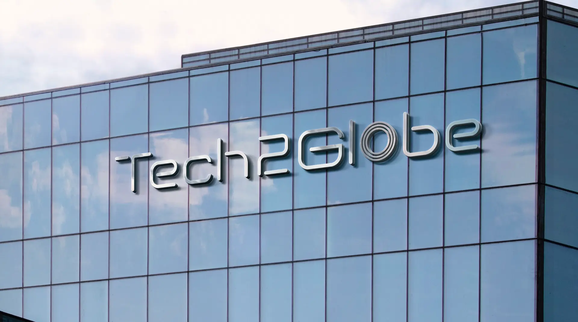
Tech2Globe wordmark at architectural scale.
14
Brand Architecture
The improved identity establishes a clearer brand architecture, creating consistency across every customer interaction.
Master Brand
Tech2Globe
Technology Services
Consulting · IT Solutions · Digital Services · Technology Management
Business Communication
Brochures · Presentations · Website · Social Media
Corporate Touchpoints
Business Cards · Office Signage · Certificates · Proposals
15
Design Principles
The redesigned system follows five major principles.
01 — Simple
Remove unnecessary visual complexity.
02 — Modern
Use contemporary typography, spacing and graphic elements.
03 — Global
Maintain the globe/connectivity idea throughout the identity.
04 — Flexible
Ensure the system works in print, digital and physical environments.
05 — Professional
Create a visual language suitable for corporate clients and international business.
16
The Improvement in One Line
Before
“We have a technology company logo.”
After
“We have a complete visual identity for a global technology company.”
17
Final Outcome
The improvement of Tech2Globe is not simply a logo redesign. It is a transition from a basic corporate identity to a structured brand communication system.
The original identity already had a strong foundation through its name and global concept. The redesign strengthens that foundation with a cleaner visual identity, contemporary typography, a flexible colour system, integrated global symbolism, stronger information hierarchy, consistent iconography, modular layouts, better brochure design, scalable corporate applications and stronger digital compatibility.
Technological
Modern and digitally focused.
Global
Connected to international markets.
Innovative
Energetic and forward-looking.
Professional
Reliable and corporate.
Adaptable
Flexible across different media.
Final Statement
Tech2Globe's identity was improved by transforming a conventional technology logo into a more flexible and contemporary brand system. The redesign retained the core ideas of technology and global connectivity while improving typography, colour, hierarchy, information design and applications — an identity that feels modern, professional and scalable across digital, print and physical environments.